

Twice this week I've been asked - about my calligraphy - "What font is that?"
And I'm lost for words - not only is calligraphy kind of the opposite of everything which defines a font, it's also a distinction which non-calligraphers aren't necessarily aware of.
Many times I've been told a piece of calligraphy is so perfect it looks printed.
Again, the very antithesis of calligraphy, especially modern calligraphy.
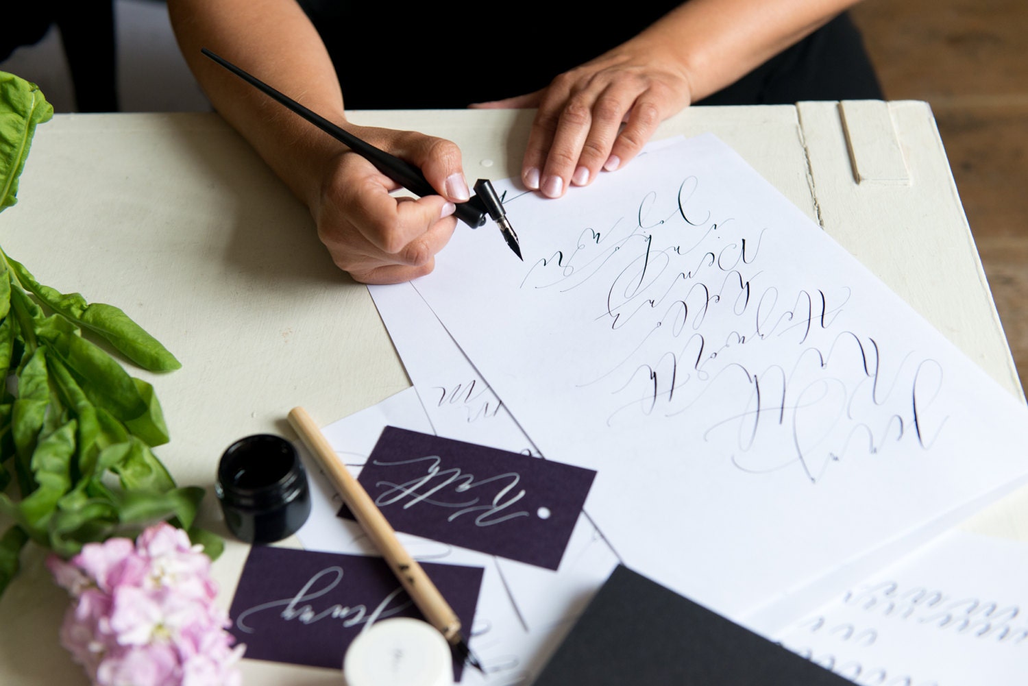
Photo credit: Jenny Heyworth Photography
I'm from the olden days where all homework was written with a Berol pen (red barrel, blue ink - you know the ones?).
I didn't grow up with fonts.
In fact, I was at college before I knew what a font even was.
So it's hard to imagine sometimes that schoolchildren know more fonts by the time they hit their teens than I did in my twenties. And it's hardly a surprise that carefully crafted, even artistic lettering, looks at first glance to be a font.
But still...
A font is a computerised alphabet (of letters, numbers and special characters).
Every character is assigned a width, a margin, and designed to be uniform.
Calligraphy is essentially handwriting.
Letters form patterns which can be carefully perfected to almost match, or artistically written to complement each other while having distinctive flourishes and spacing depending on their surroundings.
So the basic difference between a font and a calligraphy style is that fonts are made for computers, calligraphy comes straight from a pen!
Asking a calligrapher, "what font is that" is like asking a child what font they're using to write in their exercise book.
It's an impossible question to answer without going into a detailed explanation - but next time someone asks me, I'll bring them here for a little light reading!